Every screen
The whole app, laid out flat.
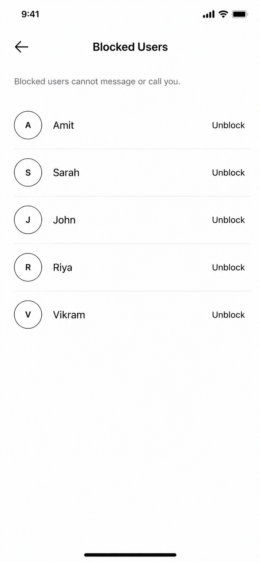
Nine screens. That's the entire experience — from your first launch to managing who can reach you.
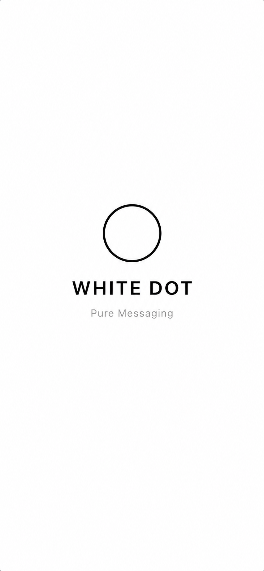
00
Splash
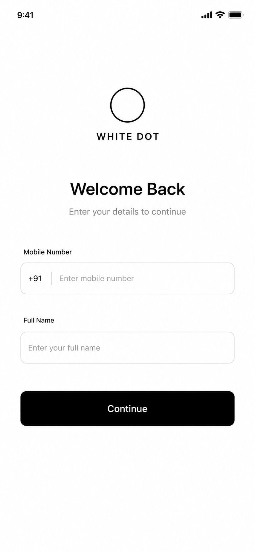
01
Sign in
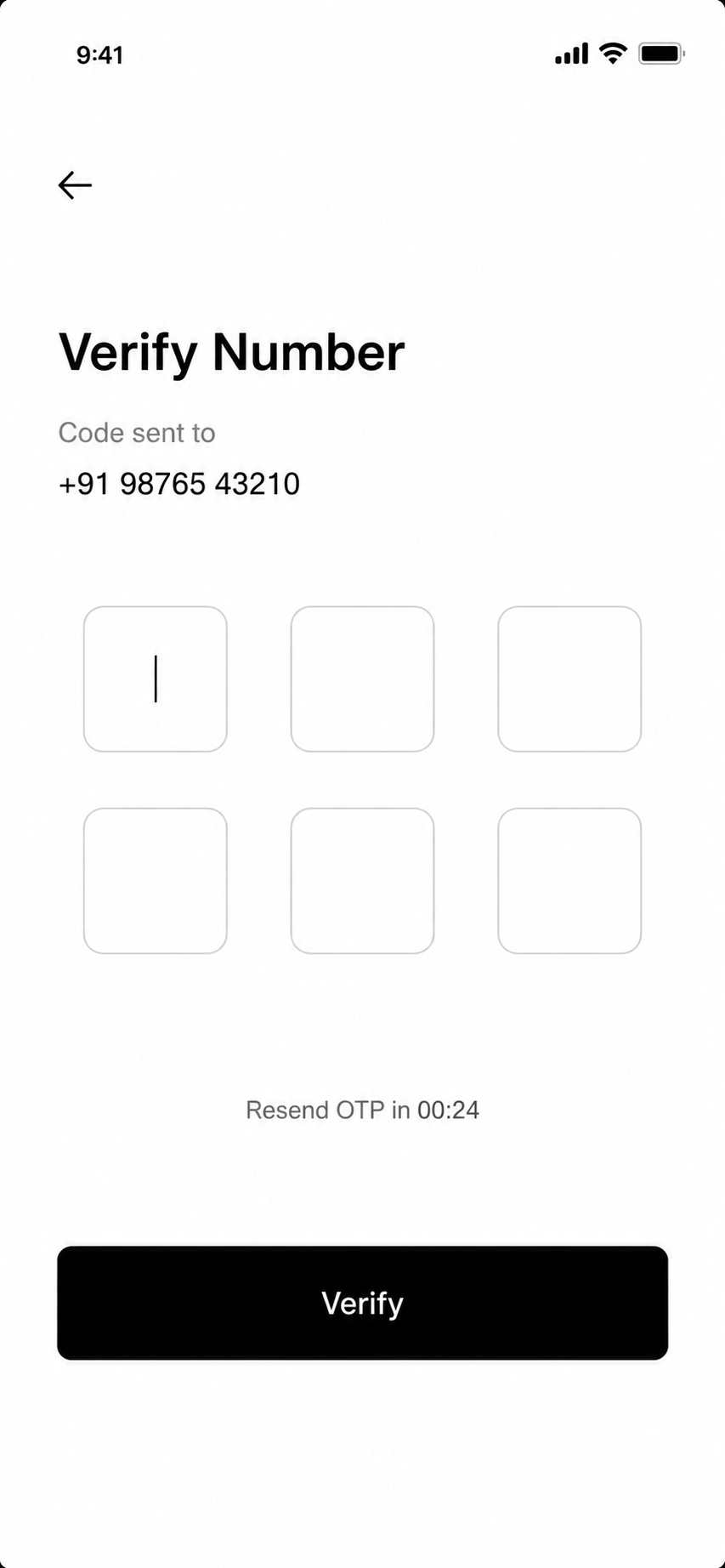
02
Verify number
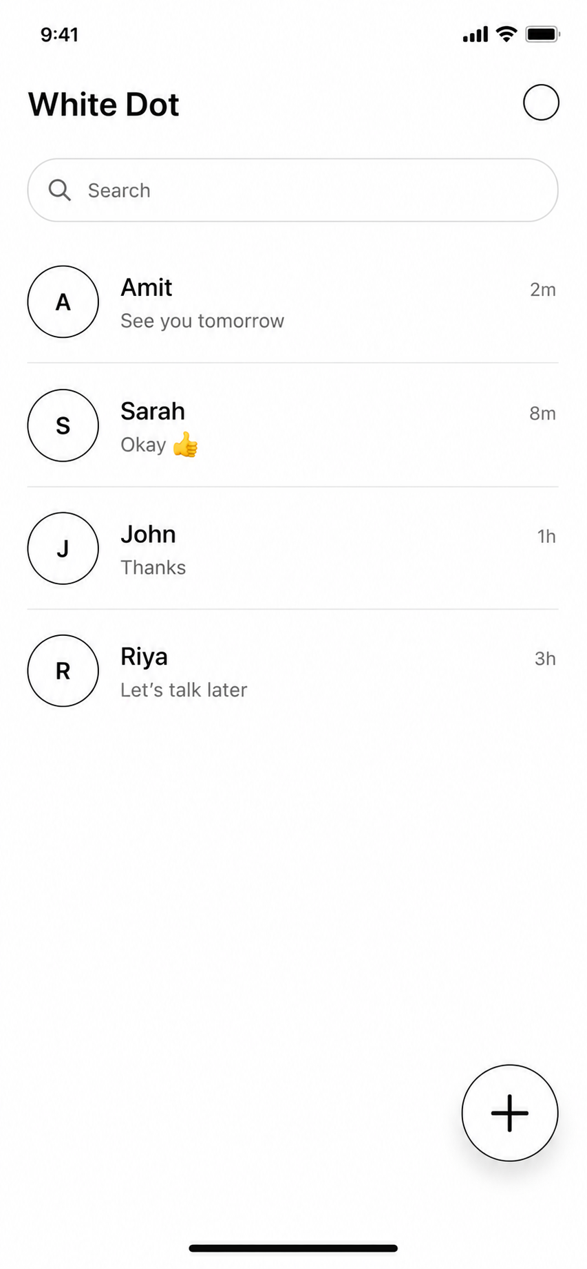
03
Chat list
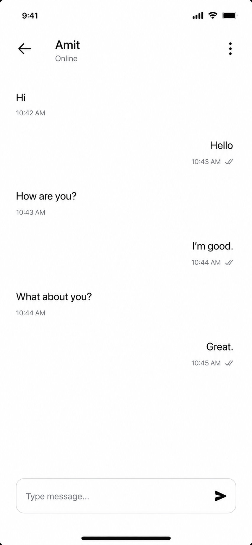
04
Conversation
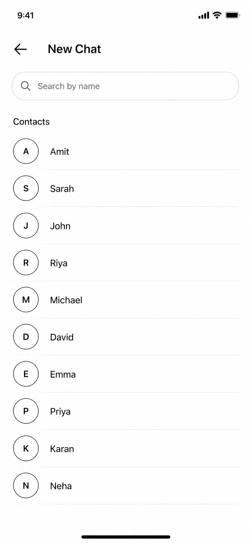
05
New chat
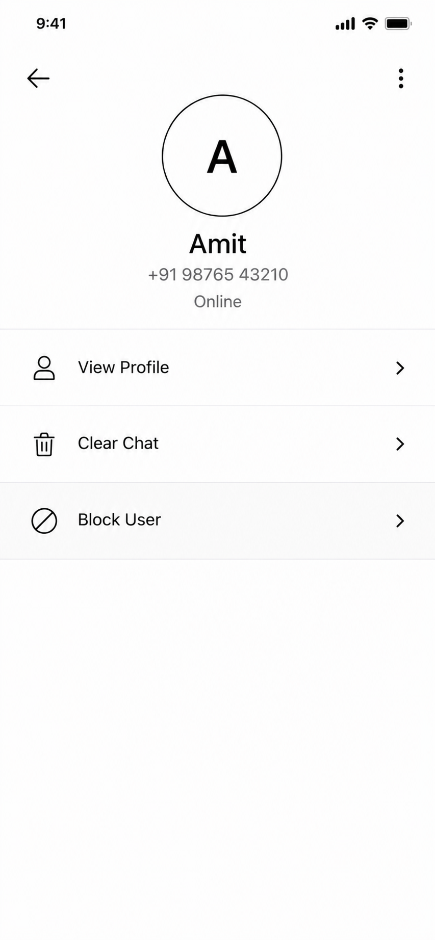
06
Chat options
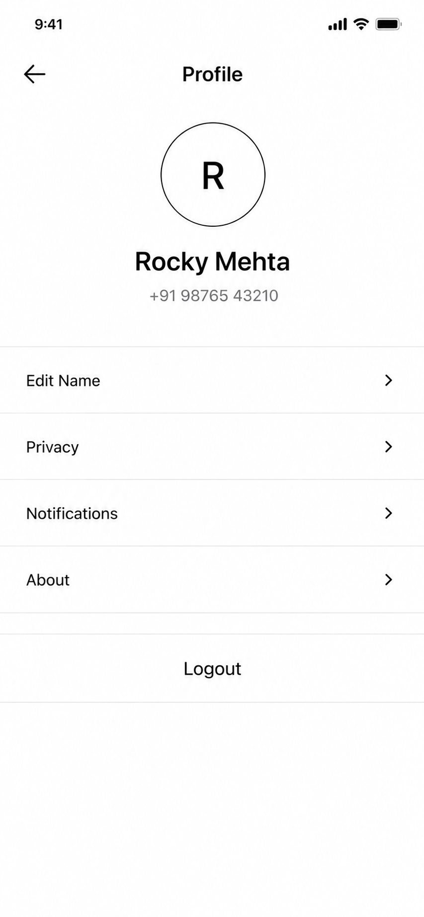
07
Profile
08